Implementing Dark Mode
· 5 min read
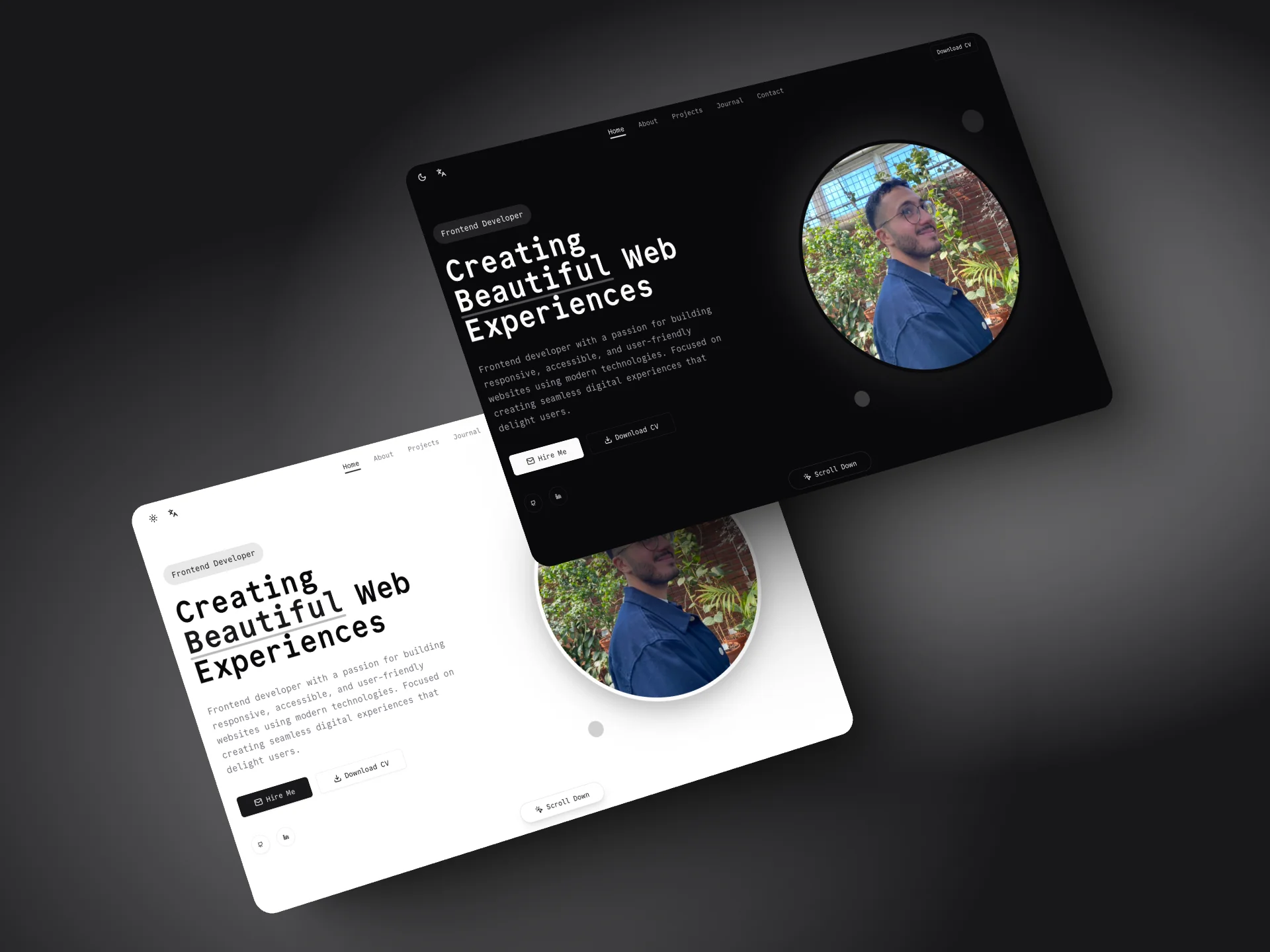
Today I implemented dark mode support in the portfolio using Tailwind CSS and a theme provider. Let me share the technical details of how it works.
Implementation
The dark mode implementation uses a combination of Tailwind CSS and a custom theme provider. Here's how it works:
-
Theme Provider: We use a custom theme provider that wraps our application, managing the theme state and persistence. This is implemented using React's Context API for global state management.
-
Local Storage: The current theme preference is stored in local storage under the key 'portfolio-theme'. This ensures the user's preference persists across sessions.
-
System Preference: By default, we respect the user's system color scheme preference using the prefers-color-scheme media query.
-
Smooth Transitions: All color transitions are animated using CSS, with a duration of 300ms for a smooth experience.
Code Implementation
Here's how our theme implementation works:
// Theme Provider Setup
const ThemeProvider = ({ children, defaultTheme = "dark", storageKey = "portfolio-theme" }) => {
  const [theme, setTheme] = useState(
    localStorage.getItem(storageKey) || defaultTheme
  );

  useEffect(() => {
    const root = window.document.documentElement;
    root.classList.remove("light", "dark");
    root.classList.add(theme);
    localStorage.setItem(storageKey, theme);
  }, [theme, storageKey]);

  return (
    <ThemeProviderContext.Provider value={{ theme, setTheme }}>
      {children}
    </ThemeProviderContext.Provider>
  );
};
Color System
Our color system is built using CSS variables and Tailwind's color palette:
:root {
  --background: 0 0% 100%;
  --foreground: 240 10% 3.9%;
  /* ... other light mode variables */
}

.dark {
  --background: 240 10% 3.9%;
  --foreground: 0 0% 98%;
  /* ... other dark mode variables */
}
Technical Stack
- Tailwind CSS: Used for dark mode utility classes (
dark: variant)
- shadcn/ui: Components are built to support both light and dark themes out of the box
- Local Storage: For persisting user theme preference
- CSS Variables: Custom properties for dynamic color values
- React Context: For global theme state management
Accessibility Considerations
-
Contrast Ratios: We ensure all text meets WCAG 2.1 guidelines for contrast:
- Regular text: minimum 4.5:1
- Large text: minimum 3:1
-
Focus Indicators: Visible focus indicators are maintained in both themes
-
User Preferences: We respect the user's system preferences while allowing manual override
Useful Resources
→ Tailwind Dark Mode Guide ←
Comprehensive guide on implementing dark mode with Tailwind CSS
→ Building Dark Mode with shadcn/ui ←
Detailed walkthrough of dark mode implementation with shadcn/ui
→ Color Schemes in Design Systems ←
Great article about managing color schemes in modern web applications
→ WCAG Color Contrast Guidelines ←
Understanding color contrast requirements for accessibility
→ CSS Custom Properties Guide ←
MDN's guide on working with CSS variables
Results
The implementation provides a seamless experience when switching between themes. Colors transition smoothly, and the theme preference persists across sessions. The dark theme was carefully crafted to maintain good contrast ratios and readability while reducing eye strain in low-light conditions.
Future Improvements
- Auto-switching: Implement automatic theme switching based on time of day
- Theme Preview: Add a theme preview feature in the settings
- Custom Themes: Allow users to customize specific color values
- Transition Settings: Add user preferences for transition durations