Less, But Sharper: Rebuilding My Portfolio
· 4 min read
I've always called myself a minimalist. My portfolio didn't agree.
Somewhere along the way the homepage had collected a sparkle emoji, a rotating gradient ring, a 💼 and a 🚀 orbiting my photo, a floating </> and a ⚡, purple 3D wireframes drifting behind the contact form, and a footer with a live clock. None of it was bad on its own. Together it was noise — the opposite of what I build for other people.
So I spent a day taking things away.
Start With How It Feels
The first change wasn't visual at all. I added Lenis for smooth scrolling, scoped to the main site so the playground canvas keeps its own pan and zoom. Every "jump to section" button now goes through the same easing, so a click and a scroll feel like the same motion.
The interesting bugs lived in the seams: the mobile menu has to pause the smooth scroll while it's open, and a link from another page to a section of the homepage has to re-measure the page first, because Lenis updates its idea of the page height on a short delay.
Then Take Things Away
The hero lost its badges, glows, orbs and emoji. The contact section lost its 3D shapes — and with them a 924 KB three.js file that every page was preloading, whether it showed 3D or not. The footer went from ten components to one quiet row. The About section lost its joke stats and the "React 90%" skill bars, because nobody has ever hired anyone based on a progress bar.
The homepage went from 7,043 to 4,479 pixels tall on a laptop, and nothing I care about got shorter.
Then Put One Thing Back
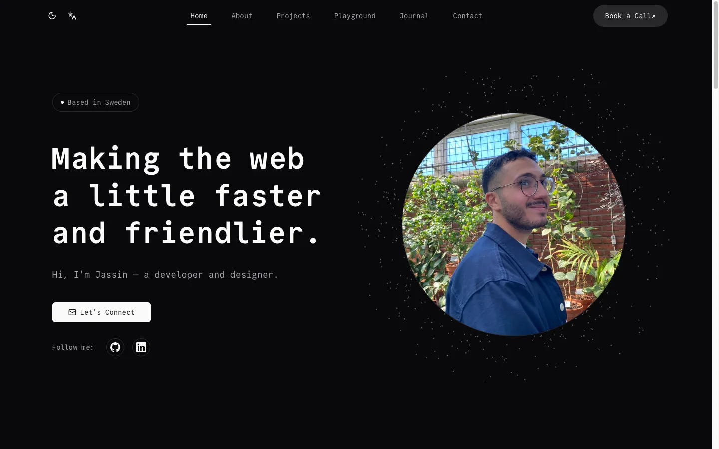
Minimal has a failure mode: empty. With the decorations gone, my photo floated alone in a big column, and I missed the sense of motion the old shapes had given the page.
So I added one thing back, on purpose. A shell of about 700 dots slowly turns around the portrait, drawn behind it so only the halo shows. It leans toward your cursor, switches between white and near-black with the theme, pauses when you scroll past, and stands still if you've asked your system for less motion. It's plain three.js, loaded after the hero has painted and only on the homepage.
One deliberate detail beats ten accidental ones.
Owning My Content Again
The bigger change was invisible. My projects, playground and journal lived in a headless CMS, with a copy in the code as a fallback — and the two had quietly drifted apart. Work I'd added in the CMS never made it into the code, so whenever the CMS couldn't be reached, my portfolio was simply missing projects.
I moved everything back into the repo and removed the CMS entirely. One source of truth, no drift, no extra request on page load. As side effects, the security audit went from 14 warnings to zero and the production build from about 20 seconds to 3.
Small Things, Done Properly
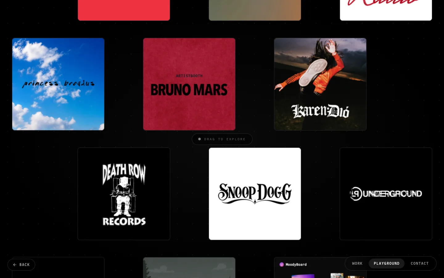
The rest was polish: playground tiles rebuilt as sharp 1200-pixel covers from the original vector logos, a mobile menu that no longer closes itself, headlines that wrap evenly, and a theme switch that takes one click instead of a dropdown — the new theme spreads out from the button in a circle.
What I Took With Me
Taking things away is a design decision, not a cleanup task. Every removal made the next one easier to see.
And the best kind of minimal isn't empty. It's choosing the one thing that earns its place.